Data Visualization Dashboard Overview:
KPI Descriptions

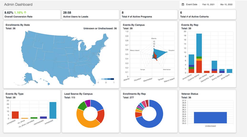
Overall Conversion Rate
- This number refers to the overall Leads/Enroll conversion rate for your school, between the selected date range.
- The green or red percentage indicator on the left of the number indicates whether the conversion rate has gone up or down, as compared to the previous rolling cycle.
Active Users to Leads
- This ratio signifies the total number of active users your school has on Edlumina, as a comparison to the total number of leads, between the selected date range.
Total # of Active Programs
- This number refers to the total number of active programs your school has on Edlumina, between the selected date range.
Total # of Active Cohorts
- This number signifies the total number of active cohorts your school has, within all of the active programs, between the selected date range.
Graph Descriptions
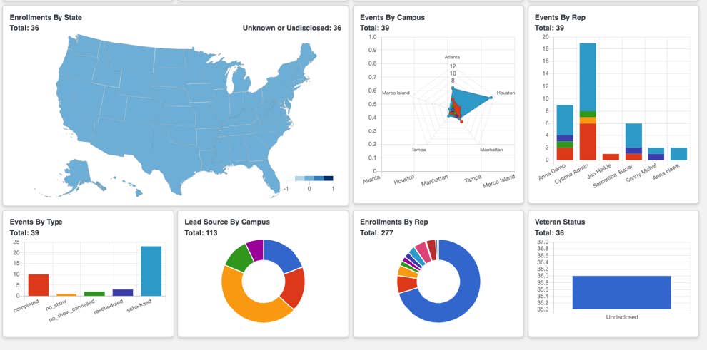
Enrollments By State
- This Heat Map is a visual representation of the enrollments your school has per State, between the selected date range.
- This data is pulled from the Lead Profile page from the “State” input bar. The number only populates on the map after the Lead has been enrolled – showing a visual representation of the States where your school’s enrollments are coming from.
- Edlumina uses keyword recognition and predictive modeling to match the State inputs on the Lead In page to the Dashboard Map. In case the open text input is not within the margin of error for our matching engine, the enrollment will be in the “Unknown or Undisclosed” bucket without a corresponding State filler on the Map.
Events by Campus
- This Spider Plot shows the total number of events by type, per campus, between the selected date range.
- Each of your school’s campuses is a different point/axis on the Spider Plot. Each “type” of event is a different color and a different layer on top of the axis of the Spider Plot.
- Depending on the number of events (within each type) a campus has, the spread of the layered coloring will be represented as long or short – longer spread for more events and a shorter spread for less events – per event type, per campus. The color scheme of the events type is represented via the legend of the graph.
Events by Rep
- This Staggered Bar Graph is a representation of the total number of events by type, per representative, between the selected date range.
- Individual representatives are shown as each of the different bars on the graph. For each representative, the height of the bar represents the total number of events they have on their Edlumina profile.
- Within each bar, the different colors for each representative shows the different types of events (as well as quantities) that they have recorded on their Edlumina profile. The color scheme of the events type is represented via the legend of the graph.
Events by Type
- This Bar Graph is a representation of the total number of events, by type, for your school, regardless of any other parameters, between the selected date range.
- Each different type of event is shown as a different bar on the graph. The height of each bar is representative of the total number of each type of event. The color scheme of the events type is represented via the legend of the graph.
Lead Source By Campus
- This Donut/Pie Chart is a % representation of the total number of leads, as sourced by the school’s various campuses, between the selected date range.
- The mathematical % of the leads is distributed on the chart by the campuses. The size of each campus on the donut/pie is a representation of the total number of leads that are a part of each campus, as a % of the total number of leads for all the campuses combined. The greater a campus’ contribution in leads, the greater the area it occupies on the donut/pie.
- The color scheme of the campuses is represented by the legend of the donut/pie chart.
Enrollments By Rep
- This Donut/Pie Chart is a % representation of the total number of enrollments, as sourced by the various users, between the selected date range.
- The mathematical % of the enrollments is distributed on the chart by the users. The size of each campus on the donut/pie is a representation of the total number of enrollments that come from each user, as a percentage of the total number of enrollments for all the campuses combined. The greater a users’ contribution in enrollments, the greater the area he/she occupies on the donut/pie.
- The color scheme of the users is represented by the legend of the donut/pie chart.
- Veteran Status
This Bar graph is a representation of the V.A./Military Service status for your leads. This data is pulled in from the Lead Profile page for all of the leads, between the selected date range. - In case your school’s leads have been recorded as a veteran, they will be shown on the “Veteran” bar of the graph. Conversely, in case they have not served or in the case that there is no record on Edlumina, they will be on the “Undisclosed” bar of the graph.
- The color scheme of the status is represented via the legend of the graph.
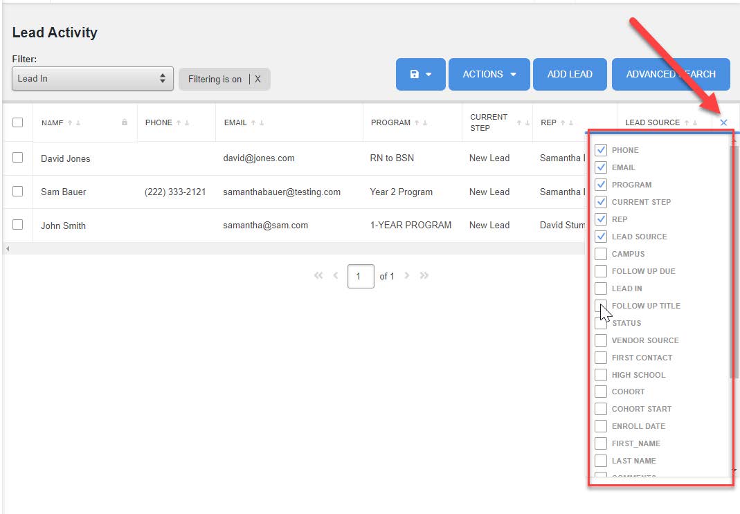
Customizable Tables/Headers Overview:
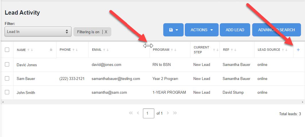
- Use the white arrow to resize, drag and drop headers into preferred place
- By clicking on the + sign you can add or remove filters based on what you are wanting to view.
- Simply check the box for the headers you are wanting to see or uncheck the box for the headers you are wanting to hide. Once you have the headers you want, just click the remove the filter options.